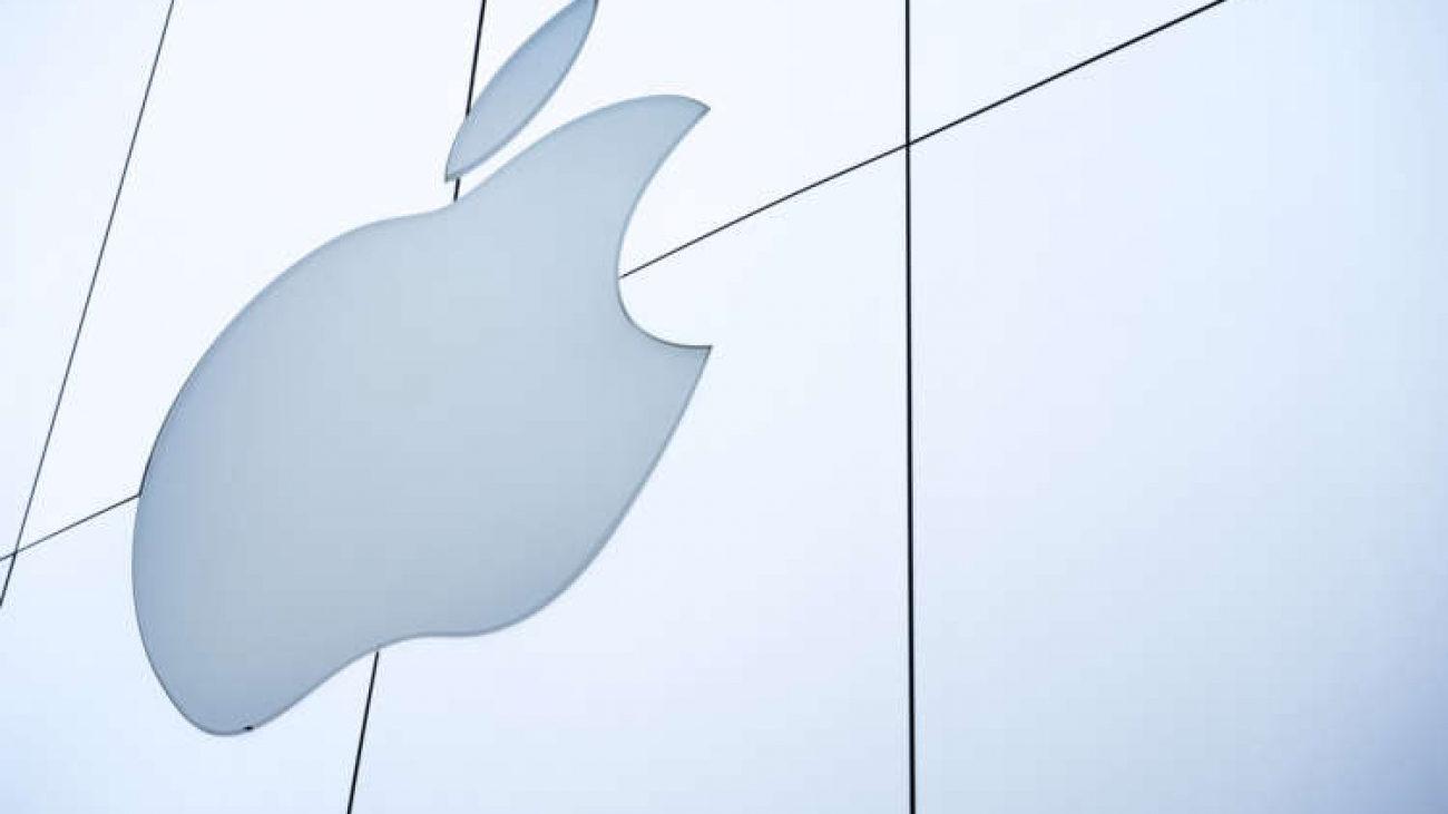
https://www.adimpact.com.au/blog/3-ways-to-improve-your-logo When asked to picture the original Apple logo, most early adopters will think of the rainbow coloured rendition of Apple’s current design. However, there exists another logo – one from 1976 – that fewer people know of. The logo is an 18thcentury style illustration of Isaac Newton sitting beneath an apple tree, with an apple dangling precariously above his head. If this design sounds completely unfamiliar to you, it’s because it was supplanted within three months by the more familiar rainbow apple. The logo was terrible, an overdesigned over-cluttered creative excretion that you had to stare at for minutes to make sense of. It only becomes more jarring when looked at in contrast with Apple’s current logo.
What distinguishes a good logo from a bad logo? Why is it that the Apple logo’s second iteration became so iconic, but its original design failed so catastrophically? Though we might be able to intuitively know which design is superior, much of our judgements on these kinds of questions rest on subconscious preferences. Today, we are going to discuss some of those preferences, and tell you some effective tips for logo design.
Simplicity
As alluded to earlier, one of the key problems with the original Apple logo was clutter. It was simply too busy, with too many features. Deeply intricate logos tend to have this problem. Even if they are aesthetically pleasing, they are not immediately memorable because the eye is being pulled in too many directions. They are also not easily communicable, as intricate logos have difficulty being expressed through speech. For this reason, it is important that your logos tend toward simplicity.
Nike, McDonalds, Mercedes & Twitter are all examples of logos so memorable that they are rarely even accompanied by their corresponding name. The companies themselves deal with vastly different industries, and their logos have no obvious relation. The only discernable link between these symbols is simplicity. This simplicity makes it easier to remember, and helps the symbols – and by extension the brand – spread.
Unique Typeface
Most logos tend to pair text with symbols. In rare instances, the symbol is eschewed entirely, and all that is left is the text (as is the case with IBM, Coca-Cola & Microsoft). Regardless of how text heavy you wish to make your logo, the unifying principle should be that a unique typeface is used.
Part of the reason why you want to avoid a generic type is that even if it suits your logo, it will make it too forgettable. Using commonplace font will only associate your brand with the myriad of others who decided to use that same style of text. By contrast, using unique font will only distinguish your logo further. Your goal is not merely to construct a piece of artwork that looks nice, but rather a piece of artwork that stands out.
If the name of your company is particularly different – and if you use an uncommon typeface – then the text itself could serve as your entire logo. Coca-Cola is a good example of this principle. It’s one of the most iconic logos of all time, and it’s simply a unique name paired with a unique typeface. It’s demonstrative of the power of uncommon styles of text.
Understanding Your Brand
Your logo is not an isolated piece of artwork; it’s also an introduction to your brand. As such, every visual choice must be made with a specific audience in mind. Colours, shapes and names should be chosen in order to reflect the preferences of your potential customers.
A good example of this principle being applied effectively is with Gillette, and its line of male and female razors. Male razors distributed by Gillette have the classic thick block text logo plastered across a black background. When marketing Venus – Gillette’s female line of razors – the logo is significantly changed. The text is contrasted with a pale blue background, has markedly thinner letters than its male counterpart and has substantially softer edges. In designing their logos, Gillette understood that people associate softer shapes and lighter colours with femininity, and starker colours with sharp edges with masculinity. Their knowledge of public perception informed their creative decisions.
Scalability
Logos are strewn across pencils and billboards, on television screens and pieces of paper. This poses a problem for advertisers. Logos must look good not just in their original iteration, but also across multiple mediums and sizes. Logos must have the ability for variation, to look good regardless if they’re scaled up or down.
Much of the problem with logo scaling arises from having too many constituent parts. For example, if logos are designed for larger mediums, it is perfectly suitable to have facets of the logo that are proportionally small. But when this same logo scales down to smaller sizes, then these features become harder to discern, and the logo loses some of its quality. To circumvent this problem, your safest bet is to make your logo one simple object. This way, people will be able to recognise it regardless of scaling.
Learning From Your Mistakes
Apple’s original logo violated every rule discussed in this blog post. But its shortcomings did not go unrecognised by its creators. Through the application of common sense artistic principles, they transformed a forgotten piece of history into one of the most immediately recognisable symbols of all time. They changed the face of their company into a cultural touchstone. And with the right application of those same principles, anyone can.
Free eBook
Fill in the form below to download the free eBook