The current landscape
According to Google, more than half of the Australian population now own a smartphone. To be precise, 52% in the first quarter of 2012 up from only 37% during the same time last year. In the same vein, 15% of Australian households now own at least one tablet device. A number which is expected to more than double by the end of the year with the proliferation of these devices as they become more affordable and as more people become aware of the benefits of owning one.
How it affects you
With the popularity of these devices, more people are now looking at your website on a screen that is smaller than an A4 sheet of paper or more often on a screen that fits in the palm of their hand. If your company website was designed and built within the last few years or dare I say more than 5 years ago, we can say with enough certainty that these smaller devices were not given any consideration. As a result, a customer or investor who arrives at your website will find it more difficult to reach your content or gather information about your company, products and services.
Our Solution
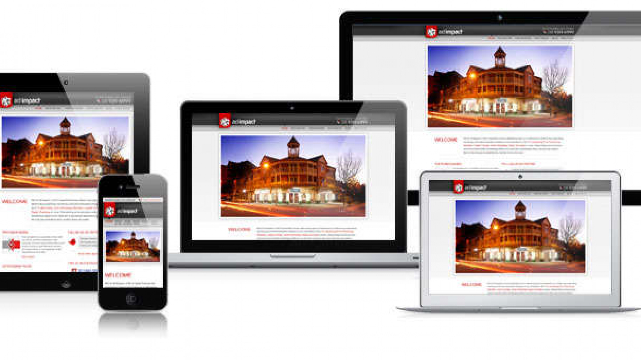
Responsive Web Design. A new fundamental approach to designing and building websites is that is has to respond to its environment from a 3.5” mobile device to a standard 21” monitor and every other screen size in between. To demonstrate this, our own company website was rebuilt earlier this year to be responsive. Give it a try, take that smartphone out of your pocket, pick up your tablet on your coffee table and visit www.adimpact.com.au. Try and rotate your device, from portrait to landscape mode. If you are reading this article on your desktop computer, try resizing your browser window. You will see how our website will appear for smaller screens. we have one website that works across all devices. This is a responsive website.
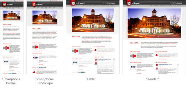
On a responsive website, users will spend less time zooming in then out and panning the browser window left and right just to consume your content. They won’t have a disconnected experience associated with serving a separate mobile only version of your website. Instead, your audience will experience a consistent and unified website from when they were checking your business on their office computer to when they went back to continue browsing on their smartphone while on their commute home to when they’re relaxing in front of the TV with a tablet in one hand.
Moving Forward
Technology is moving fast. It’s in your business’ best interest to keep up or otherwise risk getting left behind where your only captive audience are the people who refuse to upgrade their computers from the late 90’s. With the popularity of Apple’s iOS, Google’s Android and the imminent release of Microsoft’s Windows 8 – a primarily touch driven operating system, handheld portable devices are here to stay and will soon be the default standard. Are you prepared to embrace the coming wave of connected devices?
References: